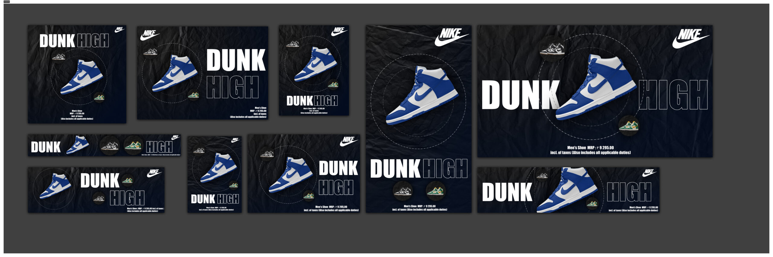

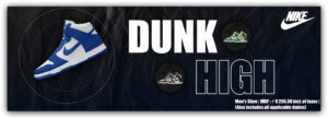
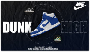
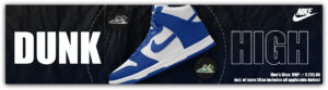
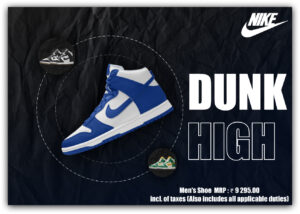
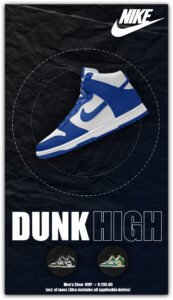
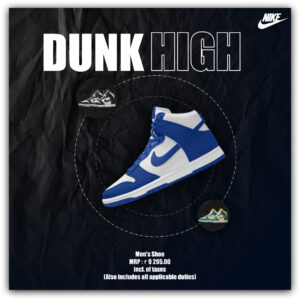
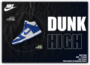
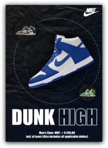
Nike Dunk High – Adaptive Layout & Responsive Campaign Design This project was a comprehensive layout exploration exercise focused on responsive digital design. The objective was to take a single hero product—the iconic Nike Dunk High—and adapt its promotional campaign across 10 distinct digital formats. The challenge was to maintain brand consistency, visual hierarchy, and high-impact aesthetics, regardless of whether the canvas was a tall social media story or an ultra-wide web banner.
Project Background
- Industry: Footwear & Sports Apparel
- Category: Social Media Design, Digital Advertising, Layout Exploration
- Context: Academic exploration of spatial balance and composition
- Target Audience: Sneakerheads, Gen Z, and urban streetwear consumers
The Challenge: Adapting to the Digital Landscape In modern digital marketing, a single campaign must live across dozens of different screen sizes and platforms. The core challenges of this project were:
❌ Scale and Proportion – Preventing the hero product (the shoe) from feeling lost in wide banners or cramped in small squares.
❌ Text Hierarchy – Ensuring the “DUNK HIGH” typography remained the dominant graphic element without overpowering the shoe, regardless of aspect ratio.
❌ Brand Consistency – Keeping the raw, edgy, and athletic Nike aesthetic unified across 10 vastly different canvases.
Concept Summary
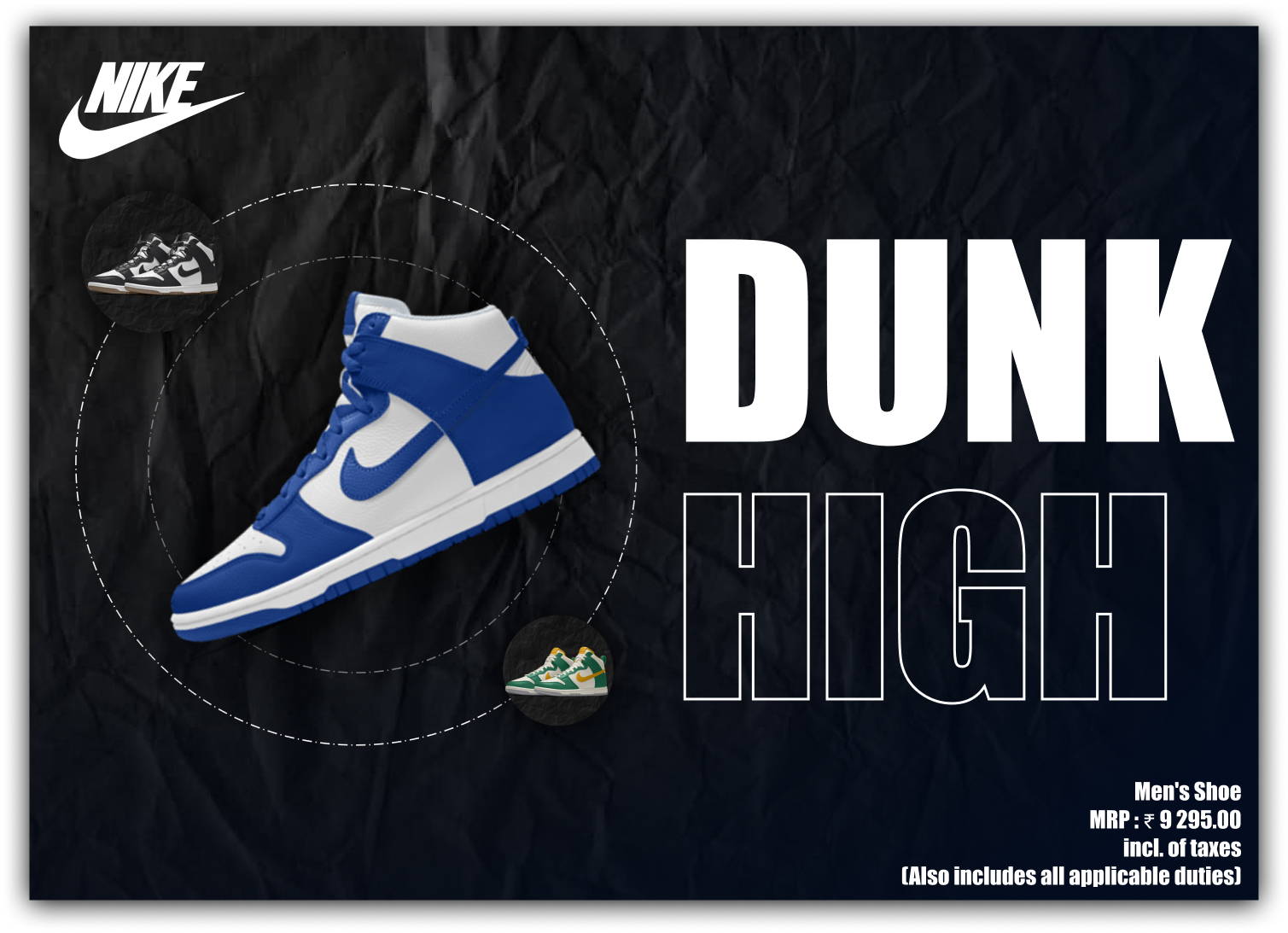
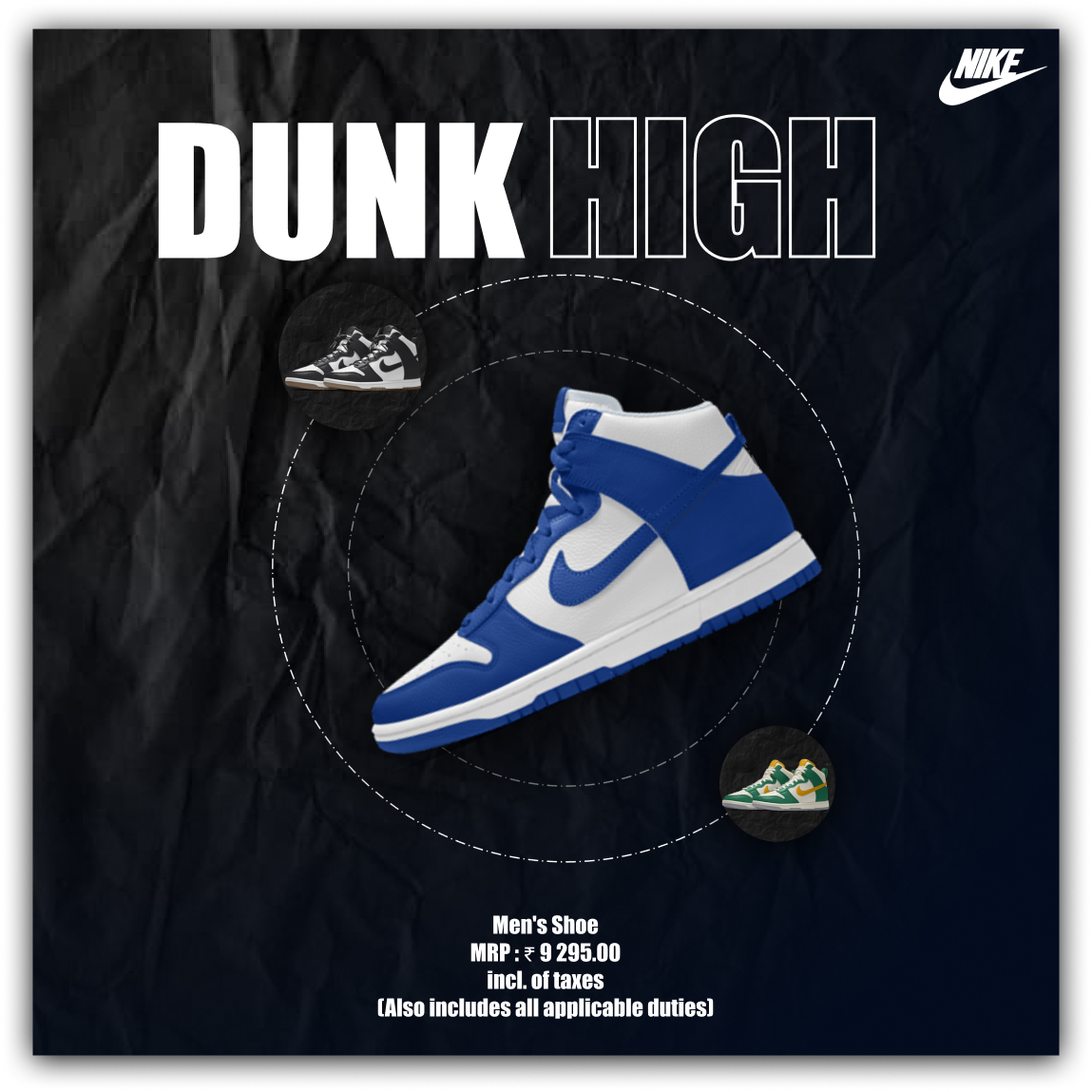
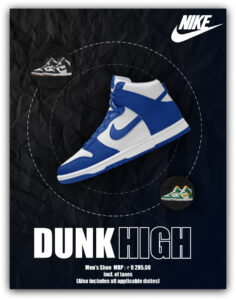
- Visual Direction: I utilized a dark, moody aesthetic with a crumpled paper texture in the background to evoke a street-style,urban feel.
- Key Focus: The exercise was heavily focused on grid systems, negative space, and compositional balance—shifting elements dynamically rather than just “shrinking” them to fit.
- Typography: Bold, outlined typography was used as a background texture that interacts with the shoe, creating depth and a 3D effect.
Project Goals
✔ Master different compositional techniques across standard digital ad sizes.
✔ Create a flexible visual system where the background, typography, and product can be rearranged dynamically.
✔ Maintain immediate visual recall for the Nike brand across all touchpoints.
Solutions Designed
➜ 10 Unique Layouts – Designed for various touchpoints including Instagram Squares (1:1), Stories (9:16), Web Leaderboards (728×90), and standard Display Ads.
➜ Dynamic Typography – Intertwined solid and outlined text to create depth, allowing the shoe to pop off the screen.
➜ Consistent Brand Elements – Strategically placed the Nike Swoosh, secondary badges, and pricing details so they are always easily readable without cluttering the main focal point.
Tools Used
➜ Adobe Photoshop
➜ Adobe Illustrator
➜ Figma
Project Info
- Date:08.21.2024
- Categories:Branding, Digital Marketing Download PDF