

Neko Pan – A Kawaii-Inspired Japanese Bakery Brand Identity
This project focuses on the conceptualization and complete brand identity design for Neko Pan, an authentic Japanese bakery entering the Indian market. The goal was to bridge the gap between traditional Japanese baking culture and modern, Instagram-worthy café aesthetics. Through a mascot-driven identity, warm typography, and a cohesive visual system, Neko Pan was designed to introduce Indian consumers to unique Japanese baked goods in a friendly, approachable, and comforting way.
Project Background
Industry: Food & Beverage / Café Hospitality
Category: Brand Identity, Packaging, Publication Design (Brand Book)
Context: Bringing authentic Japanese bakery culture to the Indian market.
Target Audience: Young professionals, students, families, and culture enthusiasts (Ages 22-35).
Problem Statement Introducing a foreign culinary concept to a new market comes with specific design challenges:
❌ Market Education: Indian consumers are largely unfamiliar with traditional Japanese bakery items like Shokupan (milk bread), Melon Pan, and Anpan. The brand needed to feel instantly welcoming to encourage trial.
❌ Cultural Representation: Finding the delicate balance of integrating authentic Japanese design elements and ‘kawaii’ (cute) café aesthetics without leaning into overused or inaccurate stereotypes.
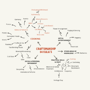
Mind Mapping
Concept Summary
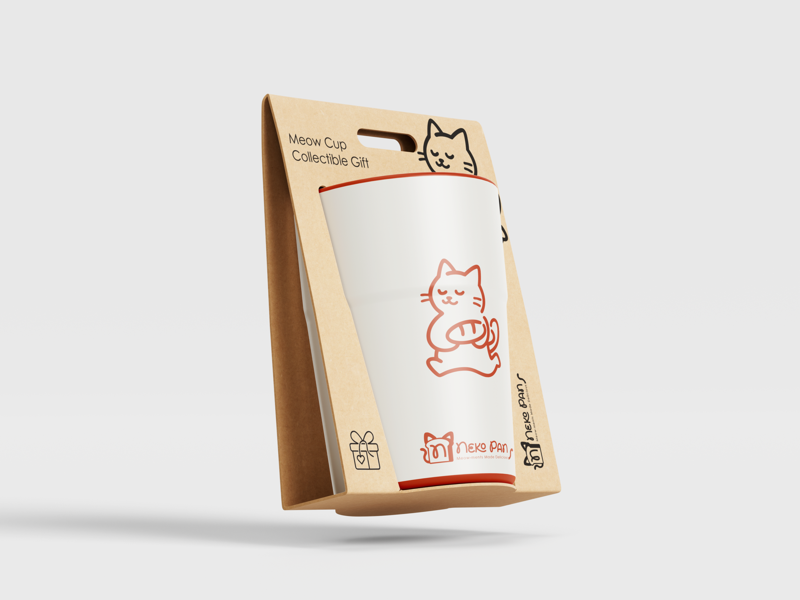
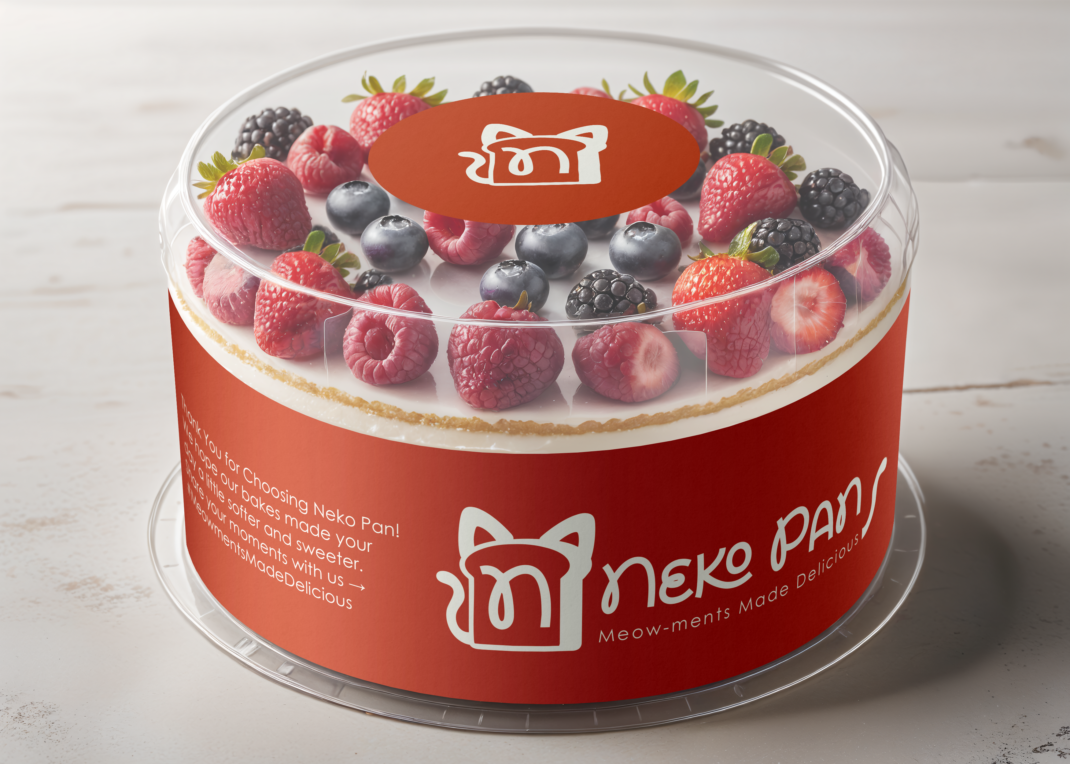
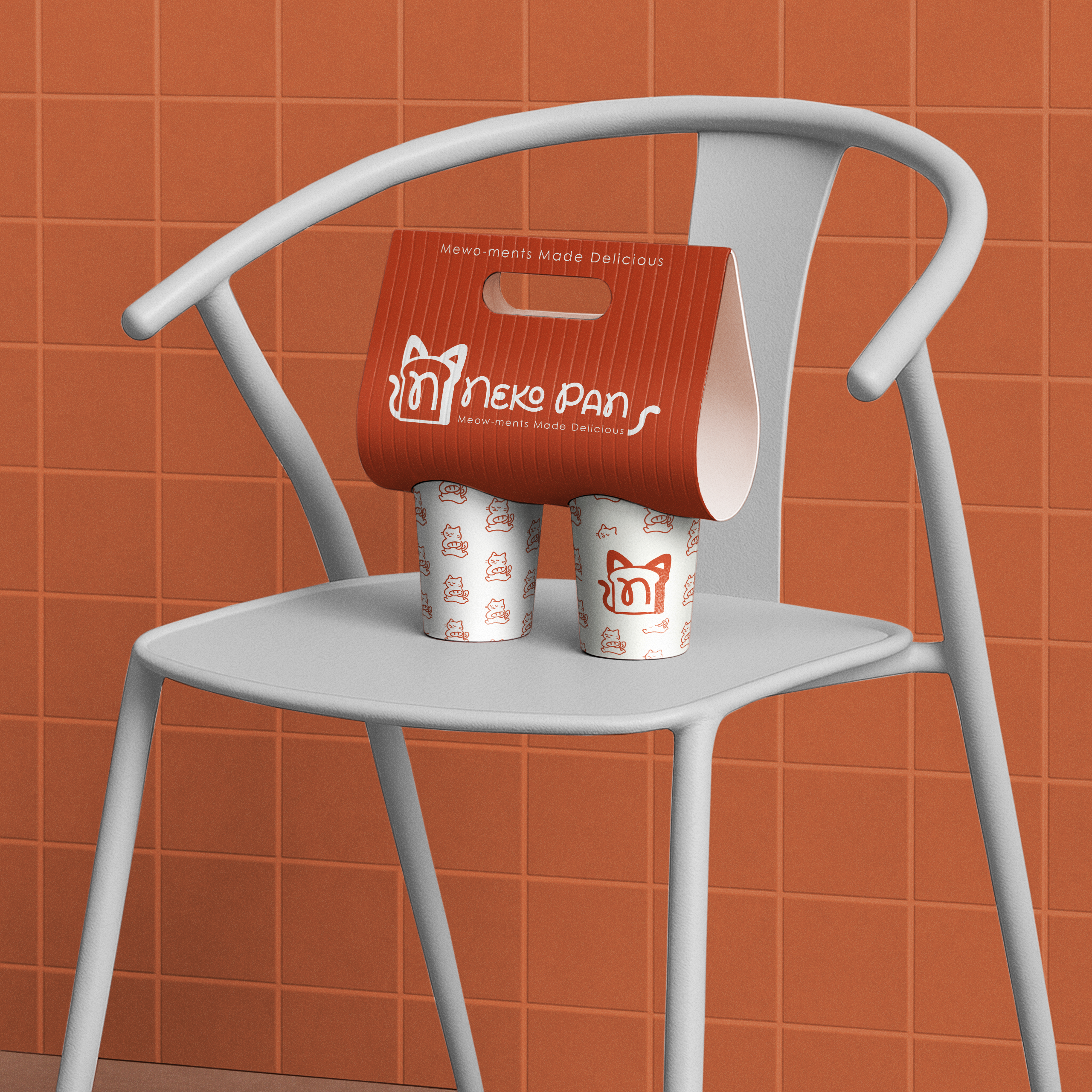
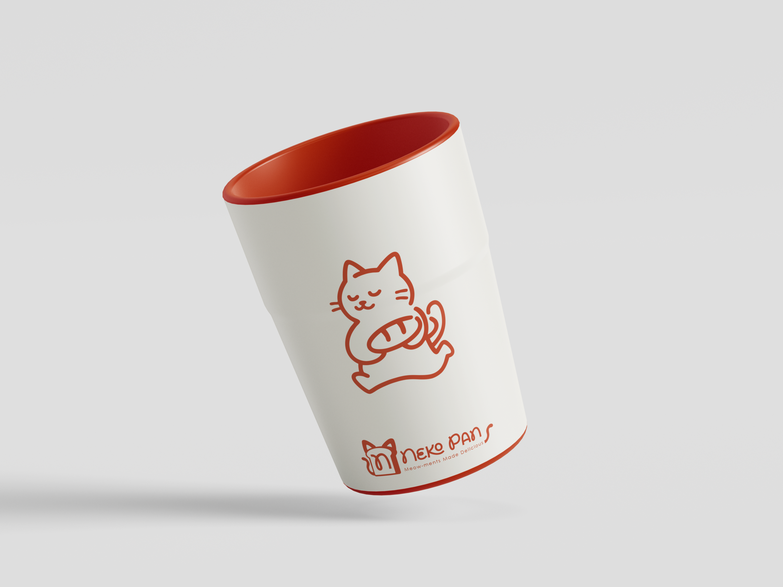
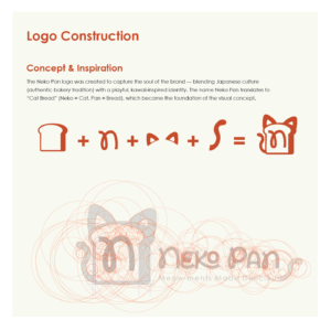
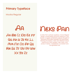
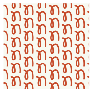
Nomenclature: The name “Neko Pan” translates directly to “Cat Bread,” serving as the foundation for the visual identity.
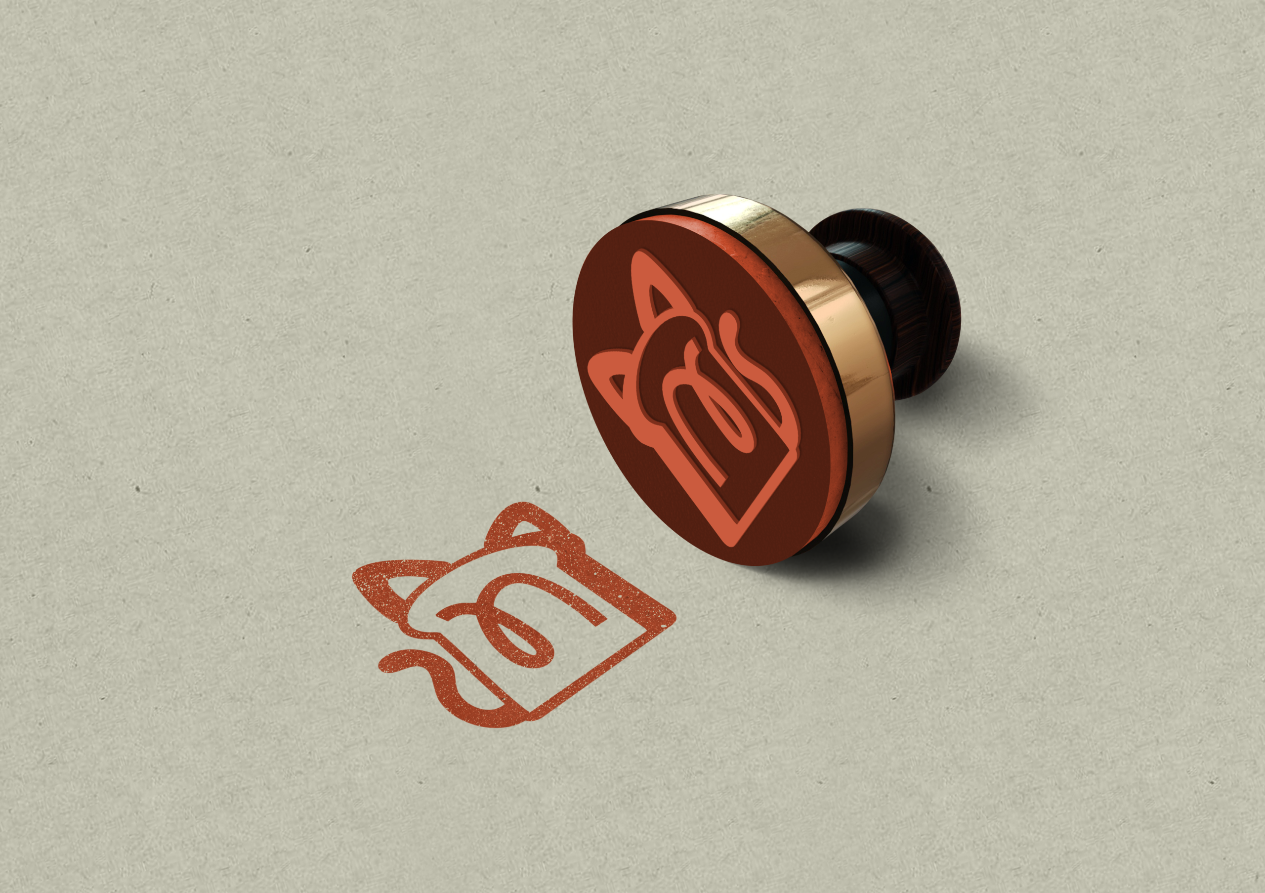
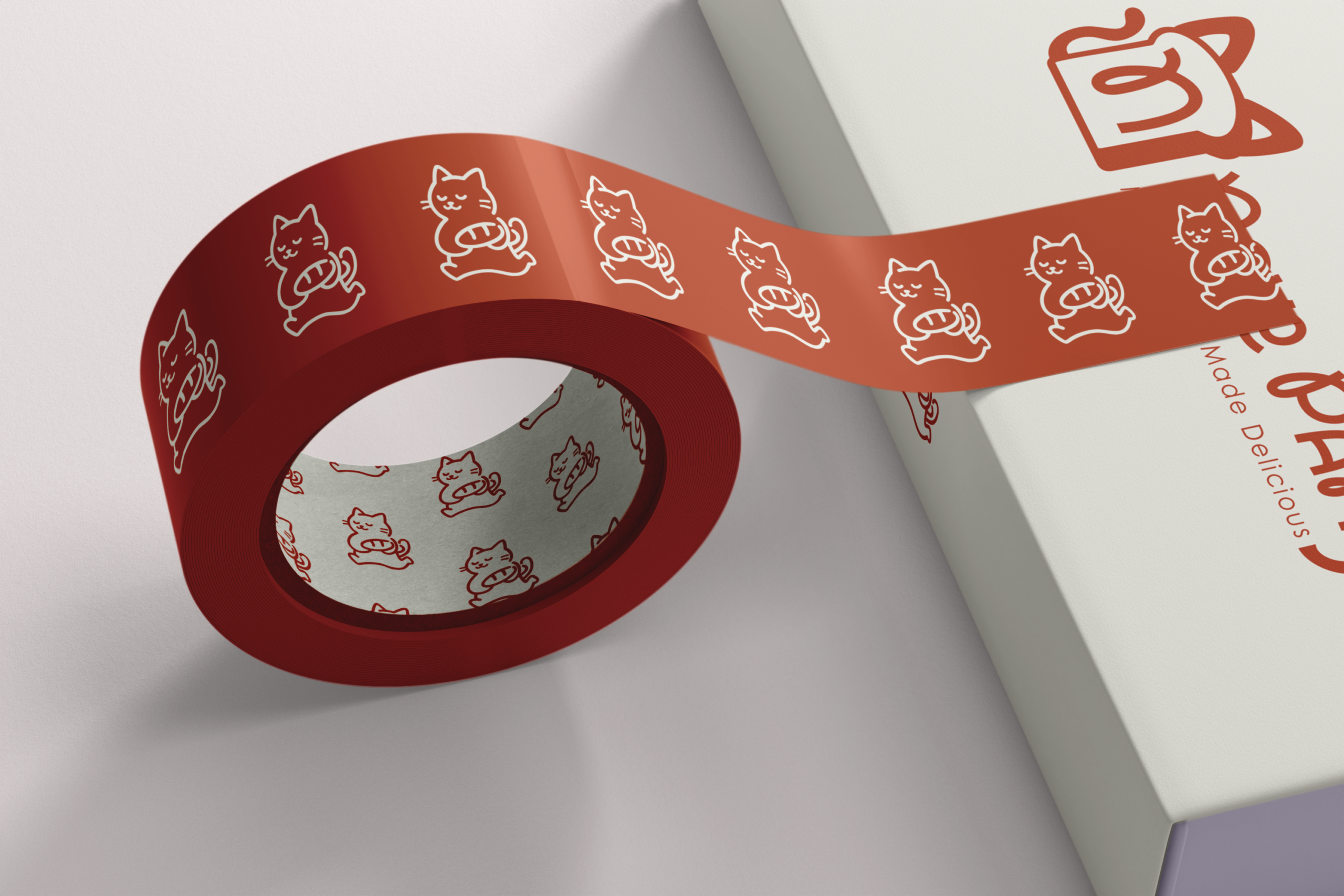
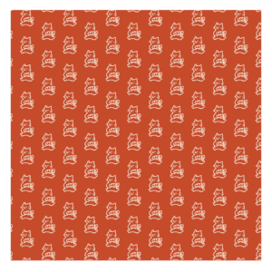
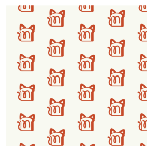
Visual Direction: A minimalist yet playful mascot design that merges the silhouette of a cat with a slice of bread, embedding the letter ‘n’ into the center. The cat symbolizes coziness, warmth, and joy—mirroring the feeling of eating fresh bread.
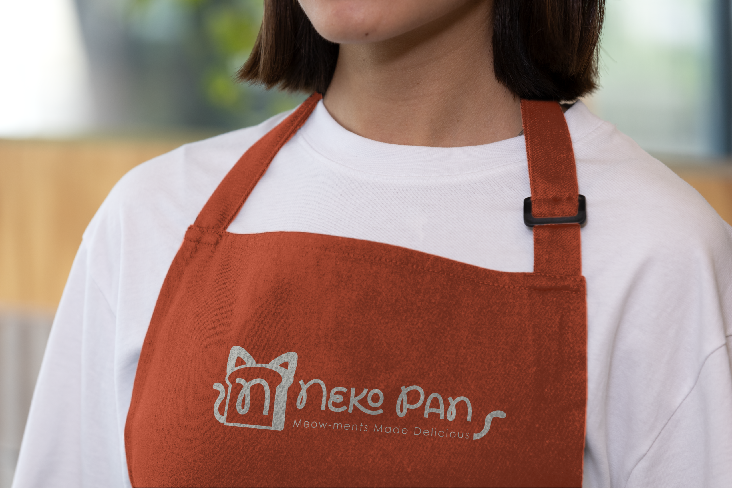
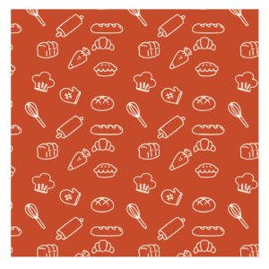
Color Palette: A warm, appetizing duo of Terracotta Red (#C44B2A) and Off-White Cream (#F7F6EF) was chosen to evoke the inviting atmosphere of an authentic bakery oven.
Project Goals
✔ Create a distinctive, mascot-driven brand identity that evokes comfort and playfulness.
✔ Develop a scalable visual system applicable across physical packaging, print media, and digital platforms.
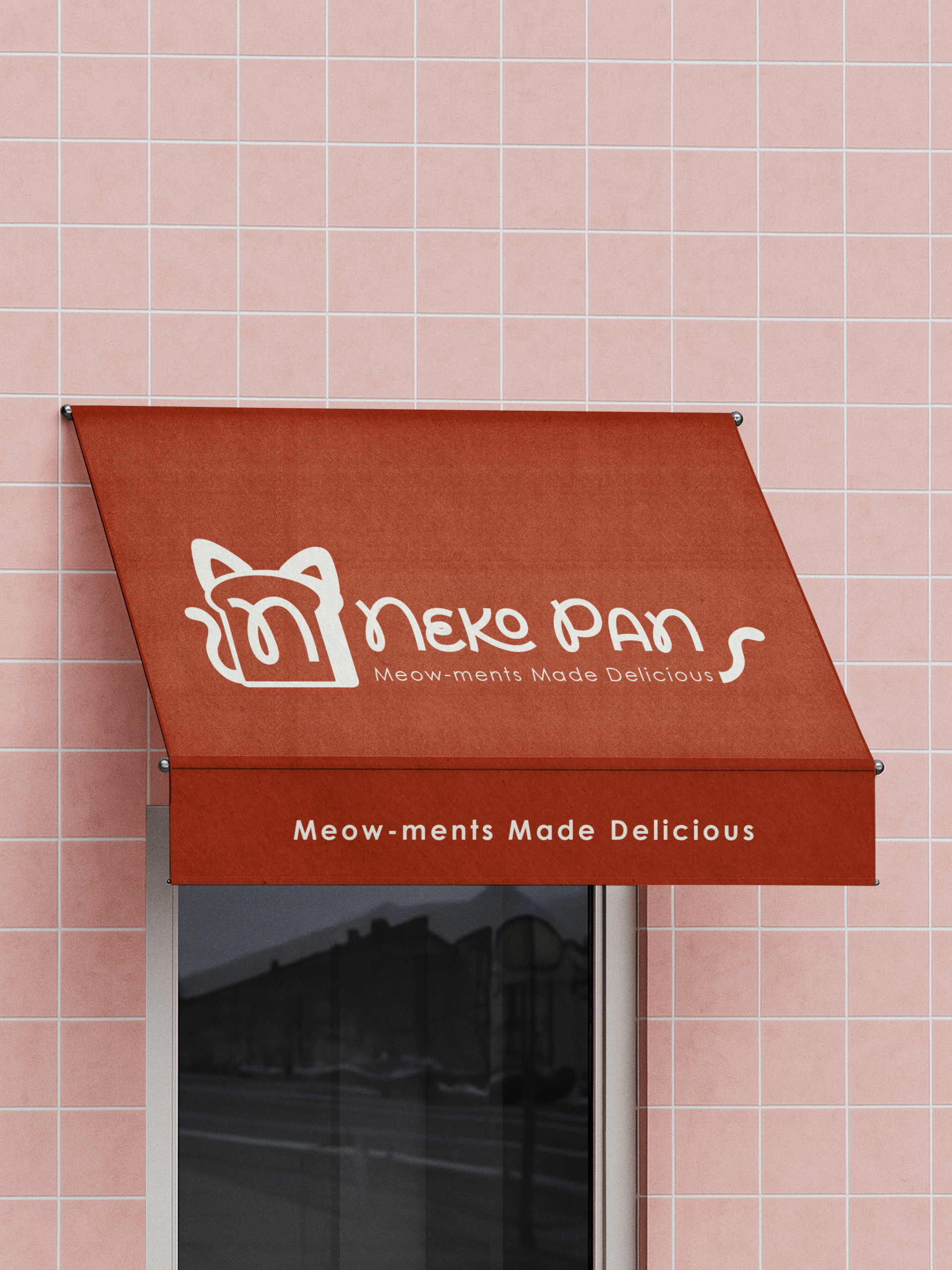
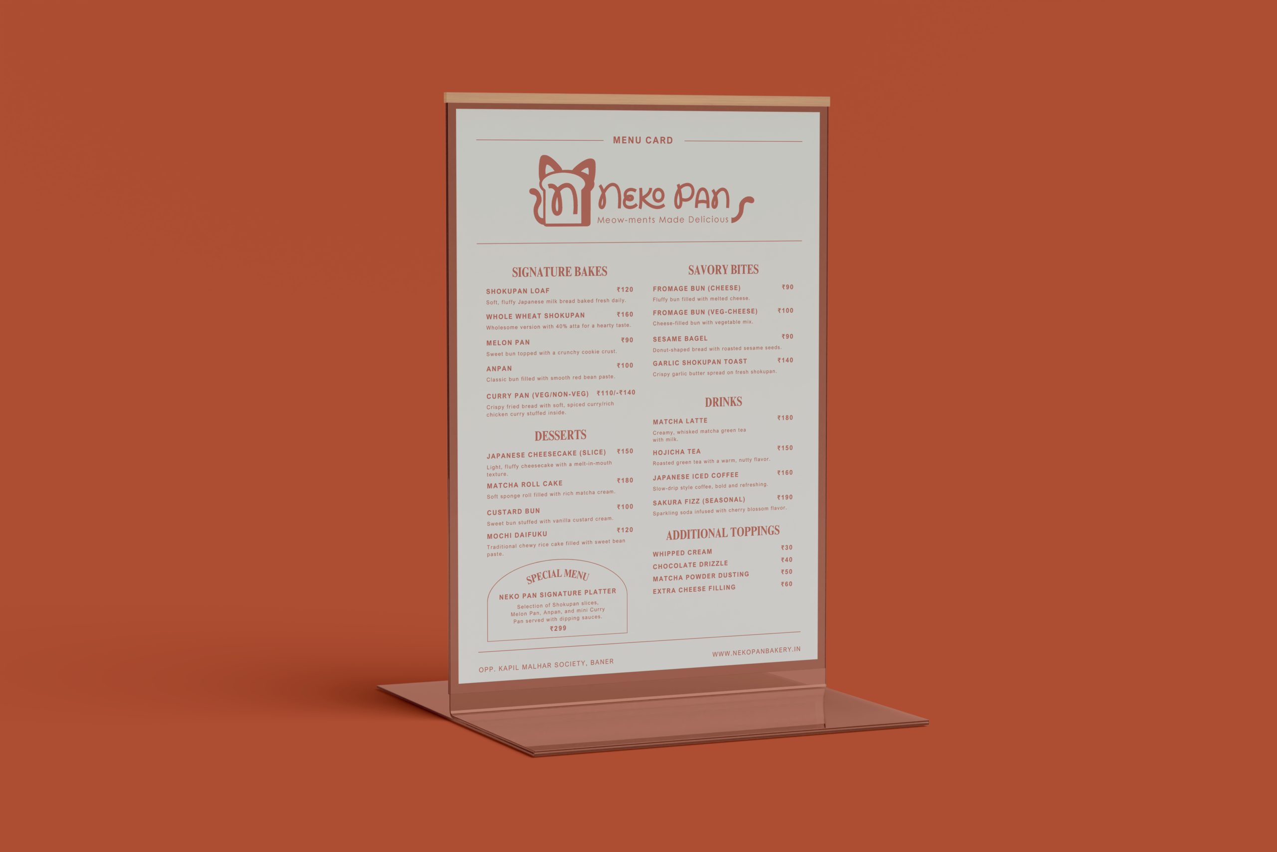
✔ Establish a clear, friendly brand voice through taglines like “Meow-ments Made Delicious”.
Logo Construction
Solutions Designed
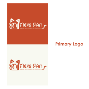
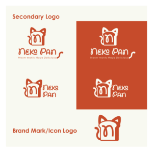
➜ Primary & Secondary Logos – A flexible logo system ranging from the full mascot wordmark to simplified icons for tight spaces like stamps and social media avatars.
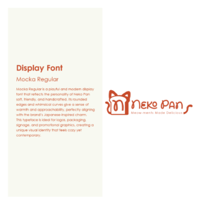
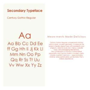
➜ Typography System – Paired ‘Mocka Regular’ (a handcrafted, whimsical display font) with ‘Century Gothic’ (a clean, modern sans-serif) to balance playfulness with high readability.
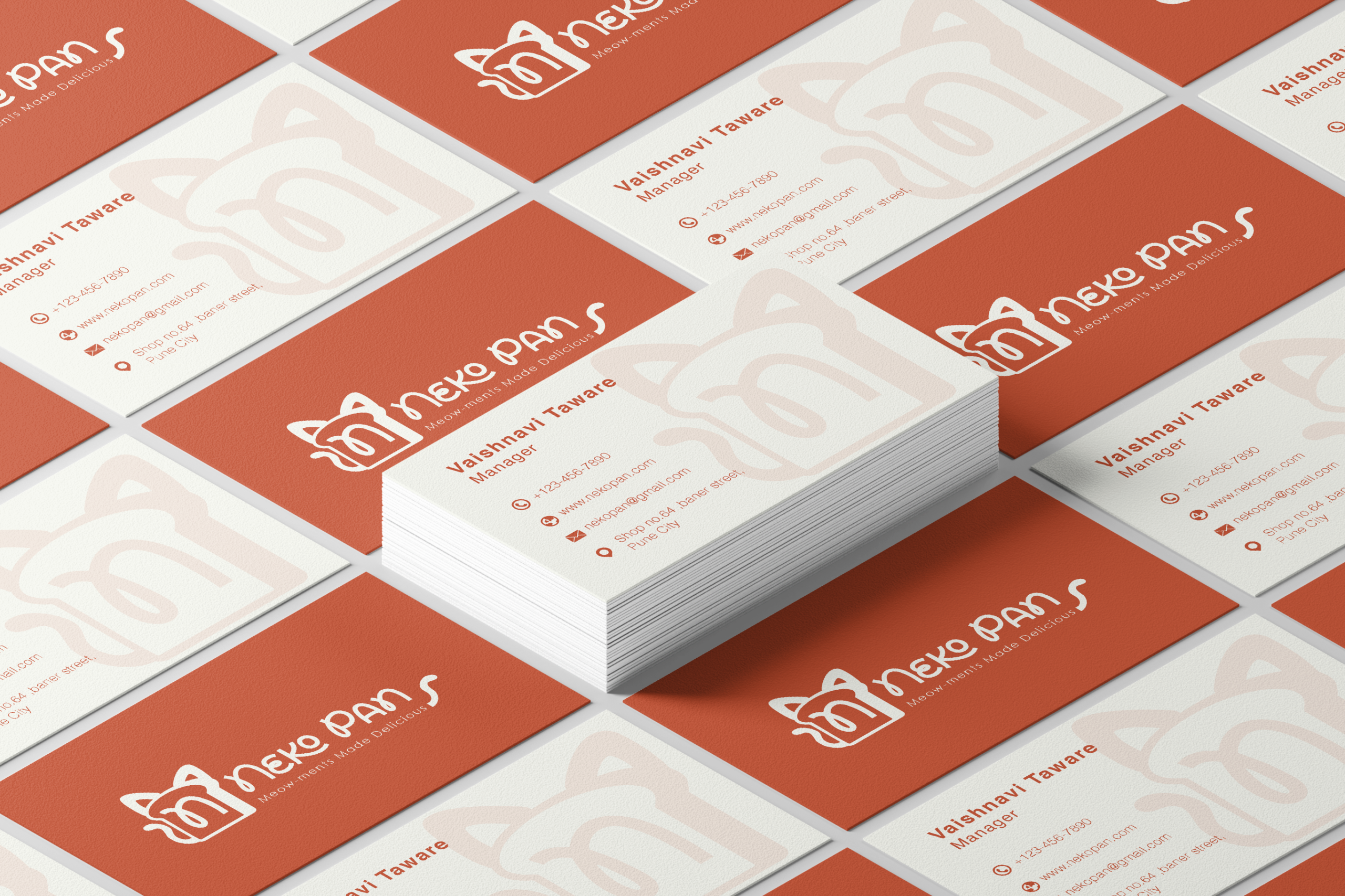
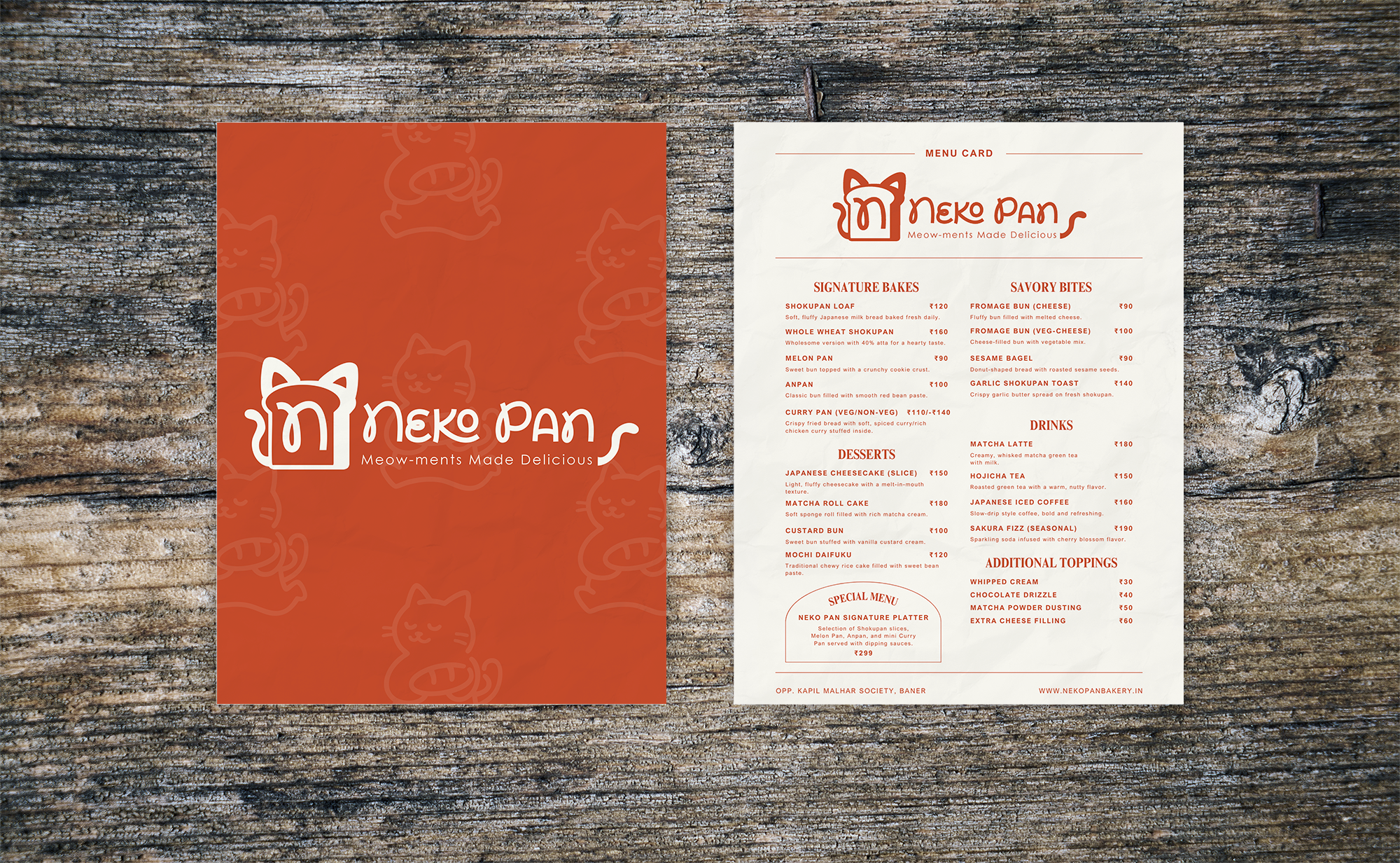
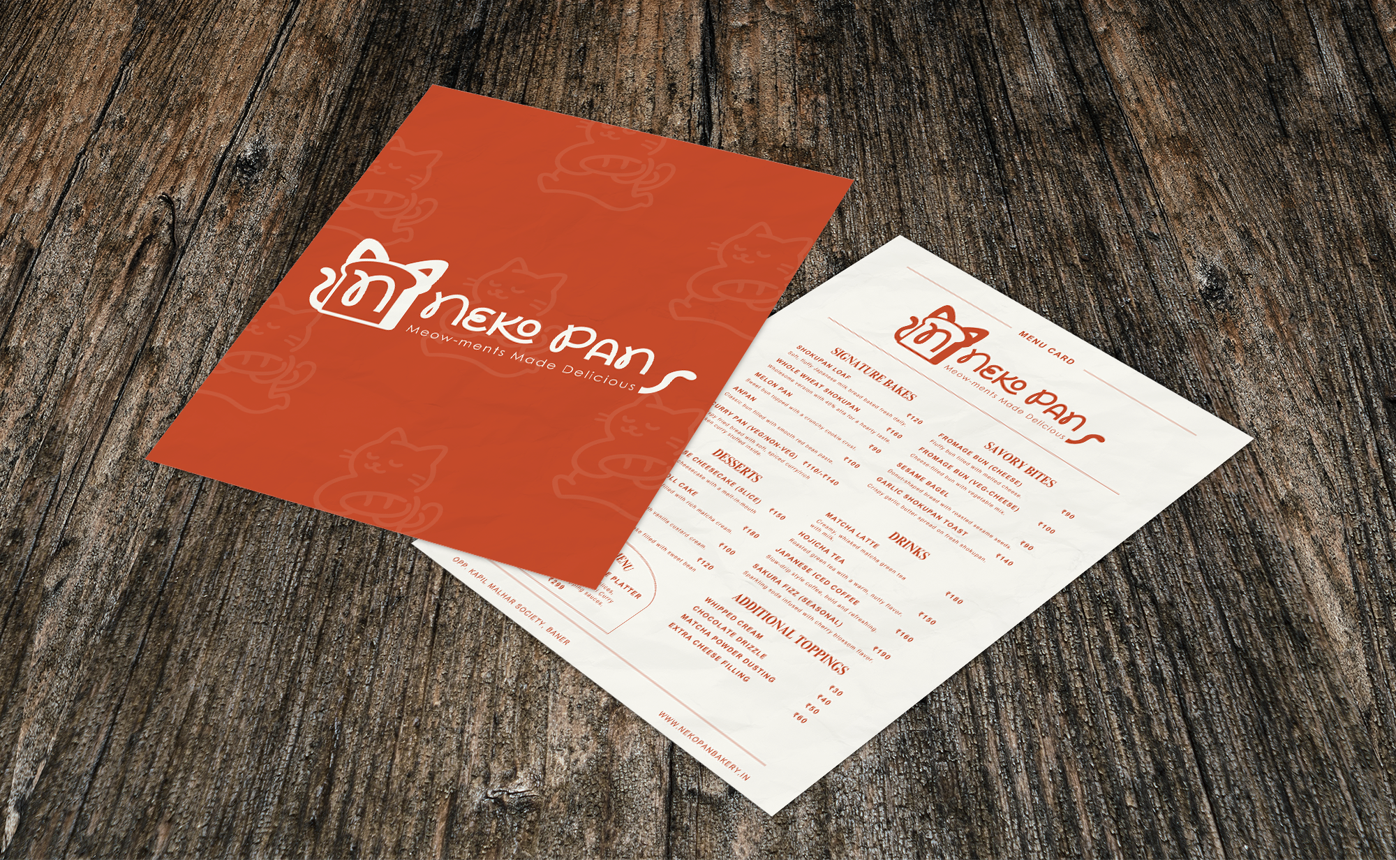
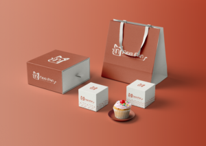
➜ Comprehensive Packaging & Print – Designed custom pastry boxes, branded bags, playful packing tape, menus, and business stationery.
![]()
![]()
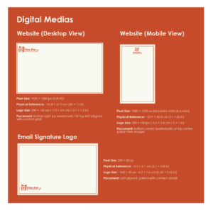
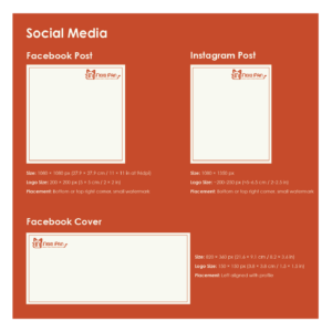
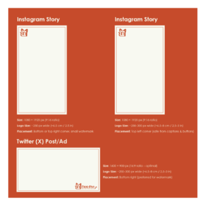
➜ Digital Brand Assets – Created responsive layouts for desktop/mobile websites, email signatures, and a cohesive social media grid template.
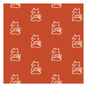
Brand Patterns
Tools Used
➜ Adobe Illustrator
➜ Adobe InDesign
➜ Adobe Photoshop
Project Info
- Date:05.24.2026
- Categories:Branding, Illustration, Logo Design
- Share: Download PDF